They’re pretty fonts and they’re released under SIL Open Font License 1.1. I dig it.
That texture healing looks super nice. Is that something fonts can just do or does it require special editor support?
It’s basically a different type of ligature - it is standard to OTF fonts, but requires ligature support in your editor/terminal. Just need to enable ligatures and/or enable specific ligature sets. See https://github.com/githubnext/monaspace#editors or maybe https://wezfurlong.org/wezterm/config/font-shaping.html for the general procedure in a supporting terminal.
Is there a way to disable it but keep ligatures?
From https://github.com/githubnext/monaspace#editors :
If you want coding ligatures but do not want texture healing, you can omit the
caltsetting:Thank you!
Texture healing works by finding each pair of adjacent characters where one wants more space, and one has too much. Narrow characters are swapped for ones that cede some of their whitespace, and wider characters are swapped for ones that extend to the very edge of their box. This swapping is powered by an OpenType feature called “contextual alternates,” which is widely supported by both operating systems and browser engines.
Contextual alternates are normally used for certain scripts, like Arabic, where the shape of each glyph depends on the surrounding glyphs. And they are also used for cursive handwriting fonts where the stroke of the “pen” might have different connection points across letters. Texture healing is a novel application of this technology to code.
basically fonts were already capable of using alternate versions of characters based on their nearby characters, so they used that for these fonts to allow for seemingly-dynamic sizing/spacing
It’s an OpenType standard feature but the font rendering system has to support it and the app has to enable it. The page has a link to instructions for enabling it in VS Code but I have no idea about support status on different OS and desktop environments. I could see it working on webview on Android fwiw, I’m guessing it’s either well supported in general or at least by browsers.
Here is the comprehensive editor compatibility list for Fira Code. Should be the same.
It is well supported in all browsers and operating systems. At least VS Code and IntelliJ support it, and even some terminals.
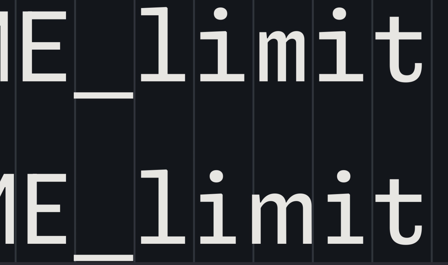
I like all of it, except for that awful “texture healing”. Imagine having words above & below like
i=mins
w=maxs
But the
m’s just slightly don’t line up because the top one is wider than the bottom one 🤢Here’s your code example in the editor. I don’t personally think the difference between the 'm’s is super noticable. But what did strike me a lot more is the difference in height between the two 'i’s in the first line. I think that difference is pretty bad.

It looks like it’s not an actual height difference, but the smaller width makes the second i look significantly smaller than the first, also implying a lower height.
thanks for rendering that! and yeah that height difference is really weird. That almost seems like a bug.
Also Idk if the ='s make the m smaller or bigger.
If the streching is so small as to be unnoticable (and I agree it’s pretty subtle) then I also don’t really understand the benefit.
If the streching is so small as to be unnoticable (and I agree it’s pretty subtle) then I also don’t really understand the benefit.
Typically, the idea behind this sort of design is that it should be unnoticeable. The motivation is that, with other monospace fonts, the differences in character width, along with the inconsistent spacing and line thicknesses are both noticable and distracting. Some of this badness is avoidable, and this is what this font attempts.
and yeah that height difference is really weird. That almost seems like a bug.
I’ve been informed, (and had to double check because I didn’t believe it,) that the two "i"s are actually the exact same height. The first looking larger than the second is an optical illusion. Font design is hard.
They would still line up, wouldn’t they? Or am I misunderstanding how the texture healing would work… Would they not take the same total amount of space?

Each line is the same total length but the “m” in “mi” would be wider than the m in “ma”
Why the fuck is a page about fonts using 50% CPU?! Is it mining crypto or something?
That’s just modern web dev
I really hope Chrome gets its shit together and stabilizes the chrome.processes API during my lifetime so I or someone can make an extension that autokills or at least warns you about these shitty pages.
Average website experience in 2023
Hmm nothing really jumped out at me at first glance, I don’t mind the ligature stuff, but also love monospace for the aesthetic.
But I am glad they’re experimenting with this stuff. Ive always wanted a sarcastica font, we’re almost there with sArCAsm. But it’s a pain to write :)
Holy shit, I never even thought to do something like this. Hahaha. I’m gonna try it later.
I love the idea of using multiple font faces at the same time while looking at code. I wonder if (hope?) terminals will one day soon support switching fonts with control sequences… Would be pretty awesome!
That’s actually a really cool idea. Now I hope this too!
not sure about escape sequences just yet, but Kitty gives you insane control over font rendering https://sw.kovidgoyal.net/kitty/conf/#fonts
I don’t think I’ve ever felt the urge to apply an alignment chart to monospace fonts of all things, but Xenon and Radon are basically lawful and chaotic evil respectively.
I still like Fira Code better. These are really nice and if there was a fast and easy way to implement fonts to my syntax highlighting maybe I’d give it more of a spin, but that seems really annoying to set up and baseline I don’t find any of these easier to read than Fira.
I used to use Fira Code, but my new personal favorite is MonoLisa
Ooo… I like the purple one (Krypton). Very space-aged.
The fonts are nice but I absolutely hate the “copilot voice” text moving around idea, it’s absolutely terrible to read.
I don’t think the intention is that Copilot voice would be animated, I think they just had a dumb idea to highlight it that way in the demo. Look closely, and you’ll see the Copilot voice is the only text there written in the “Krypton” font. The animation indeed looks godawful.
I hope you’re right
they look nice, I especially like Krypton, but to be honest cascadia code was already great. If it ain’t broke, don’t fix it
There’s even caskaydia cove for nerd fonts.
Looks nice, I’ll try it today and see how it goes. At least MS doing something good for a change…unless they added spyware to a font!? LOL
it’s free until they decide it isn’t
Neon and Argon: Seem okay. They’re really quite similar though. It’s like the designers couldn’t decide which they liked more and so just decided to release both.
Xenon: It feels alright. The horizontal serifs give everything a more uniform look, but you can also get that with any other serif font.
Radon: Uh, no thanks. It’s like someone took the weird letters from Dank Mono and said “what if we did that but for the whole font?”
Krypton: What if we just took OCR A and added ligatures? Alternatively, “Floating Point Precision Error: The Font”
Overall, none of these are compelling enough to make me want to try them. I quite like the Texture Healing feature, but it’s not enough to make me want to move to it.
Also, using multiple different fonts in one code file sounds horrendous.
Radon, the “handwriting” one, seems like if someone wanted to have Comic Sans but for code.
That’s exactly how I thought, I’m not a dev myself but are there really people who might use a font like this to code?
Some might. I using Comic Code and Fantasque Code from time to time as it forces my brain to reinterpret “known” code and helps to find errors that way. It also help with minor dyslexia moments. I like Radon, except I fully hate how “i” character is looking it is a “z” with a dot on it. If there were variant with normal “i” I would consider using it.
And sadly one more font I will never be able to use due to missing support of non-latin characters.
Sadly some features are nice.
Damn, these are pretty good.
I’ve been using Iosevka for quite a while now which is very tall and thin by comparison to most fonts. These are wider, but that makes them more favorably compare to Consolas, still overall my favorite font for the console (Cascadia Code looks weird with Antialiasing IMO).
Going to give Xenon in particular a week to try it out. Love a programming font with serifs.


