For what i heard, a lot of people on the Linux community use Krita for image manipulation, even though, it’s intended for digital painting, and GIMP is the one intended for image manipulation, because people don’t like the GIMP’s UI.
My issue is, i never understood why they don’t like the GIMP’s UI, since i never have issues with it,(Although it’s probably because i’m used to the UI) so i need to adress this problem and ask you What does the GIMP UI has that you don’t like or hate so much and why you like Krita’s UI over GIMP’s?
Before you event comment your answer i need to ask you to do the following:
-
Address each specific issue along with an concise and direct explanation of why you don’t like it
-
Answers such as “I just don’t like it”, “I don’t like where it’s placed” or anything alike doesn’t count as “Concise and Direct”, we are adults, not 4 year old children.
-
If you can provide a suggestion of how GIMP’s UI can be improved, it would help a lot, and maybe this issue can be solved.
-
If someone else commented something you were about to comment, upvote them, this way we can address the most common issues effectively.
-
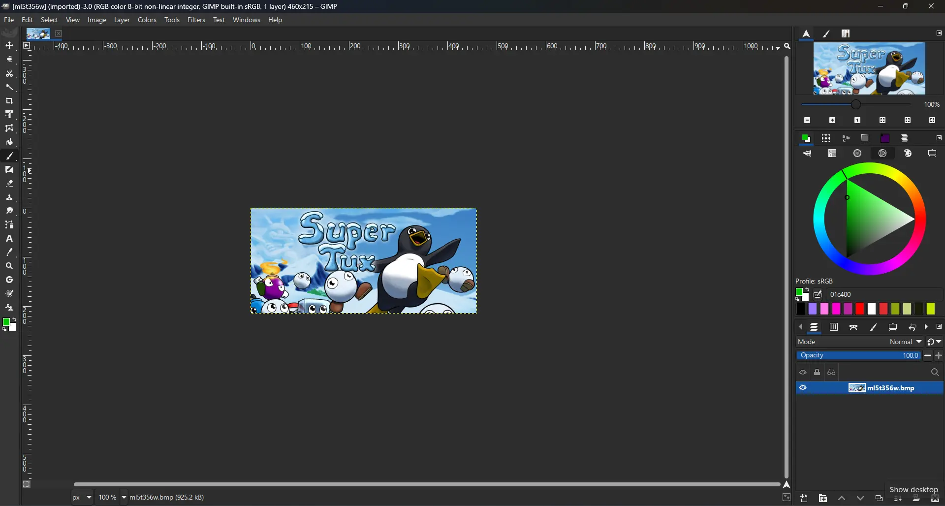
I need you to watch the screenshots of both UI’s, because something that most people don’t know, it’s how similar Krita and GIMP’s UIs are.
Krita’s UI

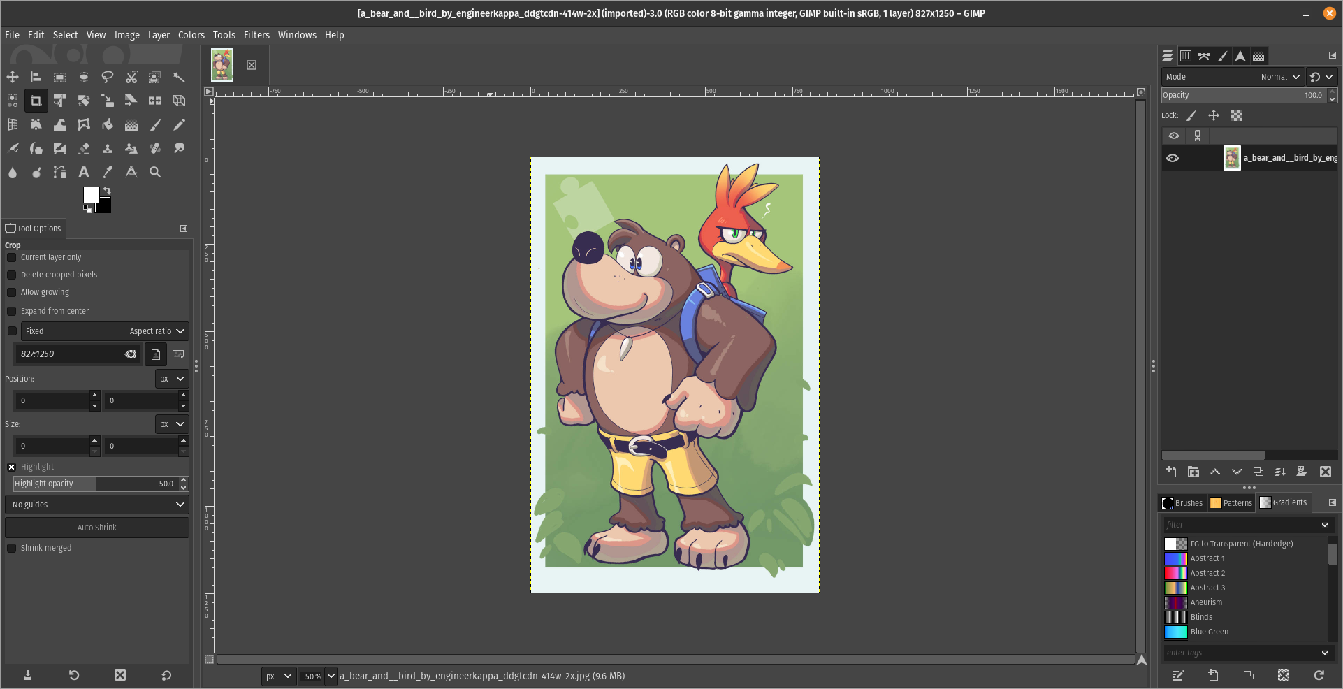
GIMP’s UI
(Credits to a friend of mine for lettig me use the screenshots.)
My ideas on how GIMP can improve it’s UI
-
Adding the option of the new UI selected by default, but with the possibility to switch to the new UI.
-
Possibly addding “work spaces” like Krita would help too, along with the possibility of exporting and importing them, this way people can have custom arrangements of the UI according to the kind of work they will do.
Thanks for reading and hopefully we can address this issue effectively.
Now admittedly I’m not someone who often uses drawing programs, but my biggest issue in GIMP is that I never seem to be able to find what I’m looking for.
In the two images you posted you can actually see an example of such a case. In Krita all the tools (or whatever you’d call them) in the bar on the left are ordered in a logical way, and separate types of tools are also visually separated by separator lines. The bar with tools is also only 2 icons wide, which makes scanning for the right tool a bit easier, since you can mostly just scan along the vertical axis. In GIMP it’s just a pile of low contrast icons in seemingly random order. Unless you’ve used it enough to know the order, you’re gonna have to do a lot more searching. And searching will be way harder since you’ll have to search horizontally and vertically.
It’s like reading a website where the text is taking the whole with of the screen and without paragraphs (GIMP) vs reading a website where the line length is constrained, the text is horizontally centered, and there are proper paragraphs.
I feel like this example reflects my personal experience with both. I’ve used quite a few different types of image editing programs, and with most of them I can fairly easily find the stuff I need. Using GIMP however, I used to be quite lost. Nowadays it’s gotten better because the windows are not all floating around and I’ve used it more. But still, I only found Krita after using a fair bit of GIMP, and yet I felt instantly more at home because the UI was easier to navigate.
Edit: That being said, GIMP is a very cool program. I don’t want to hate on it too much. It’s helped me countless times. The UI has already improved a lot since the floaty window days, and I hope that continues.
Changing icons to color helps me find which ones I’m looking for. Seems weird it defaults to it looking like they’re greyed out because they won’t work on the current selection.
For me all the things you said about GIMP, but my biggest issue is how layers work in it. It is totally unintuitive to me. Last week I tried to edit some simple image in GIMP, basically pasting some small objects and touching them up. I couldn’t get it to work properly, and would probably have redone it in Photoshop if it was to be used by more than three people for a short period.
Dude, you can put the tools on the same way as Krita, just look at this
You seem to have a pretty big monitor. Try it on a 13” laptop and you’ll see why it’s harder to use.
You can press the TAB button to temporarily hide all menus. It helps when working on small screens.
Which isn’t as easy as having the tools right there.
You can click the tool, configure it, then hit tab to work on the image. Then tab again to click on the new tool, tab, work on the image. It’s a nice and simple workflow. I don’t know what to tell you, it’s not rocket surgery. I mean, you’re the one trying to do image work on a tiny ass screen. I’m giving you a neat trick that worked perfectly for me. Sorry it is not good enough for you, I guess.
I hear you. And I use that for many situations. All I’m saying is most complaints likely come from users with small screens and the fact that the default tool setup is so large makes it hard.
It doesn’t scale properly on my HiDPI laptop display, which I use at 200% scale (Plasma 6, Wayland). Some things are too big and others too small. Hopefully GIMP 3 will bring good scaling support with GTK 3. Still, I love GIMP and will continue to use it over any alternatives.
Same deal here. Text is too big, tool icons are just about right, brushes and patterns are microscopic.
This actually makes sense, have you tried reporting this to the devs?
I have not used either, but I can say that Krita’s UI is closer to Photoshop than GIMP’s appears to be. That might be why people are opting for that application, for the sense of familiarity if they were trained on Photoshop.
I will say that any application which is used for digital painting should also be good at image manipulation, so if Krita does both well, I can see why it would be preferred over GIMP if the painting tools are lacking.
Looking over the screenshots, for GIMP, I am hoping that is not the default layout of tools. Having a jumbled block of icons is a lot harder to visually parse than a stack of pairs. I also find myself wondering why they use up so much space on the left to include a weird cutout of their mascot above the tools.
On the right, I am also not sure why the layer thumbnails are pushed so far to the right when they could be immediately adjacent to the visibility toggle.
It doesn’t look terrible to me, but I am not surprised that people using an app for visual design might be more critical of design flaws in the app itself.
Krita lacks a lot of tools to work with photography. It’s OK with general image manipulation but you have to really struggle to do anything that’s not digital painting.
That said. The left side of GIMP is wide because the tool options are under the tool’s icons. While Krita has them on the top as a bar.
Both programs let you move and change the layout to whatever you want, though. No one serious about using either program uses the default. There’s a bunch of stuff you don’t need to use that only takes up space when you’re just doing one particular task. Hence why saving and reloading layouts is such a powerful feature.
EDIT: Here is, for example, my layout.
Also, the little logo on the corner has a purpose. It’s a small area where you can drag and drop any image file from your file explorer and it will automatically open the file for editing, instead of pasting it on the current open project as a new layer. It’s super useful.
That does look better.
For the drag and drop space, however, would a simple “Right Click > Open In” not be easier? Or just dragging the file over the application on the taskbar?
Hey look, voilá, this is entirely possible

You know you can change the UI and Keybinds to make it more alike to Photoshop, right?
This sounds a lot like how people would use windows paint for simple things over photoshop. Many folks just want a simplified tool. I was estatic to find out firefox now gives simple pdf editing capabilities instead of me importing it into libre office draw.
Does GIMP even scale with monitor ratios? That was a huge problem last time I tried it. It’s a 4k world out there.
I have trouble with both, but more experience with GIMP. I can’t stand all the little tool buttons with no text. I want the name of each tool always visible on its button.
I have the same problem with Inkscape.
You know you can do this, right?

All I want is to GIMP to save tabs layout as workspaces. That is enough. Part of GIMP hate is based on 15 year old complaints. Just like people still complains today about stuff of Linux that has been resolved for decades. It’s just memery that has stuck around.
There are issues with GIMP, but none are about the stuff most people meme about in social media. Every tool has room to grow, but GIMP UI suffers from the “too amateur to know what’s wrong” loud majority effect. Imagine someone who has no concept of music appreciation in their lives sits at the front of a grand organ. Then proceeds to complain that the pedals get in the way of sitting on the stool and that he founds the three keyboards redundant and unintuitive. This notion is valid, from his point of view. But it informs nothing about the usability of that particular instrument for a professional organ player.
The same thing tends to happen with several software packages, specially the open source ones. Since they don’t have the industry standard tag, they don’t get any leniency when it comes to learning their features and capabilities. Then, when the amateur checks them out, they don’t compare it to the industry standard (which does have a leniency license) but compare it to the simplified, accessible for everyone and strip down apps. These people don’t have the foresight to understand that this tool is capable of way more than their reference point, and the initial friction is an indicator of their inexperience, not of the tool’s quality or potential.
The amateur is more comfortable sitting in front of a Casio learner piano. And we shouldn’t lend much credence to their feedback about the ergonomics or key feel of a Steinway concert grand.
The default toolbox placement is should be conform with other design software.
Sure, people can figure it out once they tried it, but majority of them will move to another software that has familiar experience out of the box.
When people asking me to install GIMP, I always change it to this layout, making it more familiar to another software like Inkscape, Krita, Affinity suites, Photoshop (and other Adobe software), etc.