Someone already mentioned Logseq, but I’m really enjoying Obsidian for my note taking needs. It’s similar, but I have found Obsidian to be very nice. Not FOSS, but I really like what the devs are doing.
- 4 Posts
- 15 Comments

 3·8 months ago
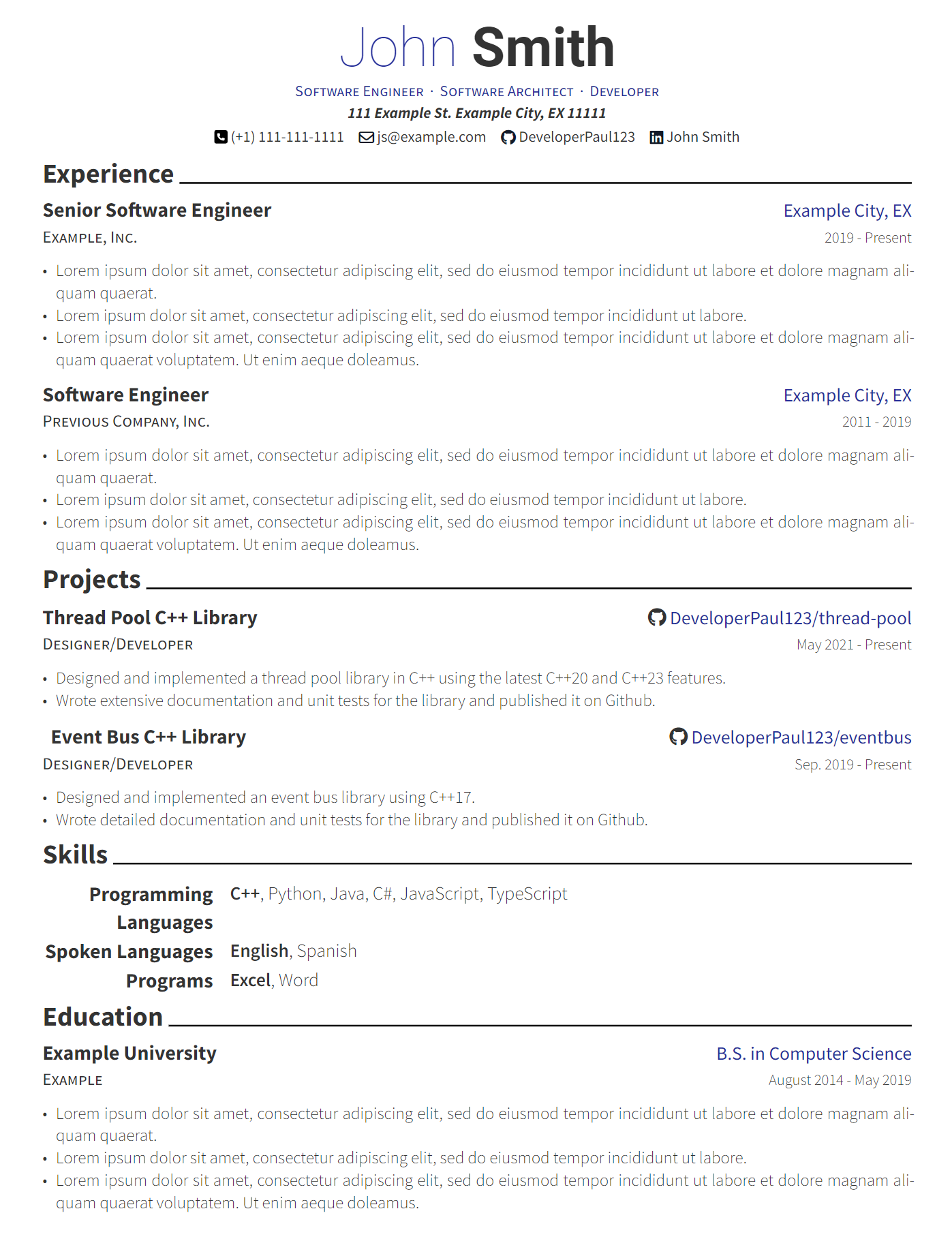
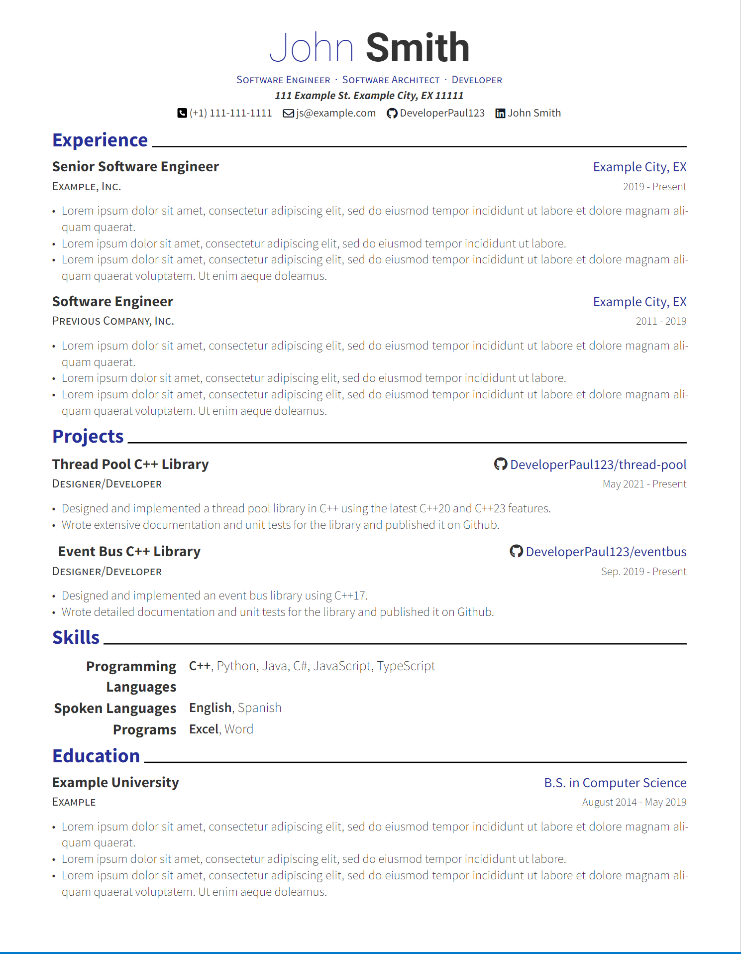
I’m working on some of the changes your suggested. Here are screenshots of the adjustments. I’m curious to hear your thoughts. Thanks!
Here is a monochrome version without colored headers. I also adjusted the default accent color, but this is user configurable as well.

 2·8 months ago
Ahh yes, I tend to forget about these “awesome” lists. Thanks for the links.
It seems that Brilliant CV is a direct port of the same latex template I used to use as well. The developer references it as well in the README. I do think my template is a bit easier to use and is more up to date with the latest typst version but there are some really nice templates on there.

 5·8 months ago
Thanks for all the feedback! I’ll take each point into consideration as I work on the next version of the template :)

 5·8 months ago
Overall it was pretty nice honestly. Especially coming from Latex. Creating a template in Latex was very difficult but in typst it’s way more intuitive (at least to me) and it’s easy to control every aspect of the text and its layout.

 2·8 months ago
Oh really? I couldn’t find a port of this before. Do you happen to have a link?

 2·8 months ago
Whoops! I ommited that on purpose. But you can add the job title back in. And yes I see how that would be good for each sub section to have the company name.
This should be doable, I’ll update this thread if I can implement it.

 3·8 months ago
I put this together in a few minutes using my template. Does this address what you meant?
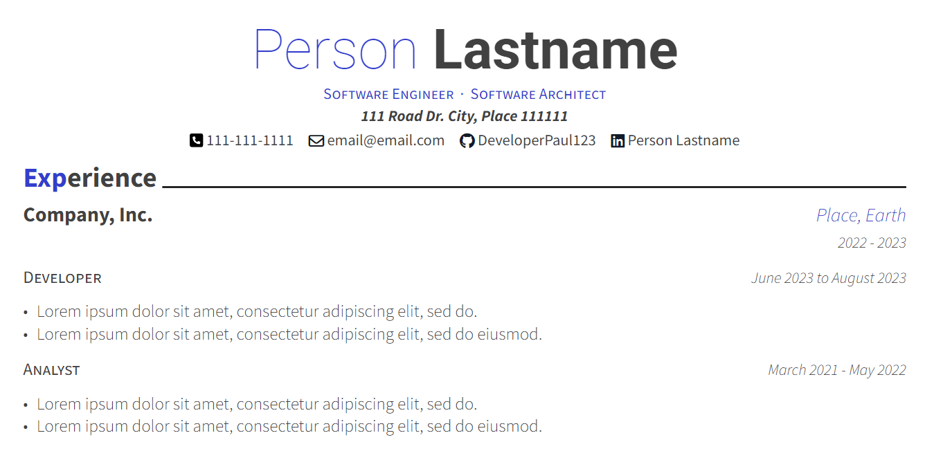
Here’s the typst code:
#import "@preview/modern-cv:0.1.0": *

#show: resume.with(
  author: (
      firstname: "Person",
      lastname: "Lastname",
      email: "[email protected]",
      phone: "111-111-1111",
      github: "DeveloperPaul123",
      linkedin: "LinkedIn Name",
      address: "111 Road Dr. City, Place 111111",
      positions: (
        "Software Engineer",
        "Software Architect"
      )
  ),
  date: datetime.today().display()
)

= Experience

#resume-entry(
  title: "Company, Inc.",
  location: "Place, Earth",
  date: "2022 - 2023"
)

#secondary-justified-header(
  "Developer",
  "June 2023 to August 2023"
)

#resume-item[
  - #lorem(10)
  - #lorem(11)
]

#secondary-justified-header(
  "Analyst",
  "March 2021 - May 2022"
)

#resume-item[
  - #lorem(10)
  - #lorem(11)
]

 5·8 months ago
This is interesting as I simply copied the same styling as the previous template I was using. Would it be better to highlight the entire first word instead of the first n letters?

 2·8 months ago
I added it to the original post, sorry about that!

 2·8 months ago
Sorry, I added the link in the post now. It’s also available on typst universe.

 2·8 months ago
It’s in the description now, sorry about that!

 1·8 months ago
Thanks!
I added the link now and yes, I really hope typst takes off as well. I’ve been using it pretty extensively where I can at work and my personal life and it’s so much easier than Latex. I haven’t done anything too complicated yet so we’ll see how it goes.
Also I added the missing link 😅

 71·8 months ago
Thanks for the feedback! I think this makes sense for those who do have work experience. Do you think this should still be the case for new graduates?
Also I should note you can easily change the order of things in your own CV.



I will likely ditch Vivaldi for this one tab groups gets implemented. It has all the features I need and I’ve been looking for a non-chromium browser to switch to for a while. Floorp was close but missing critical features. Zen is very exciting for me.