Soon there will be no color, no originality.
Just a single font to use everything will be homogeneous and consolidated. Minimal, inoffensive and focused grouped to appeal to everyone and also no one.
Movies, music, games, brands.
>New logo is soulless slop
Every single company
Makes it easier to forget them and not being able to keep them apart. That’s really great for us. Less ads in our brains.
the secret is that all logos are soulless slop. you just become attached to the old ones due to familiarity. when that familiarity is removed, you see it for what it really is.
Some have more visual distinctiveness than this new minimalist shit
A design consultant probably sent Jaguar a six-figure bill for this new logo, you know.
Jaguaren’t
The font is ugly.
oversimplifying logoes and stuff makes me rage, especially this
/uj Technically this is their new logo:
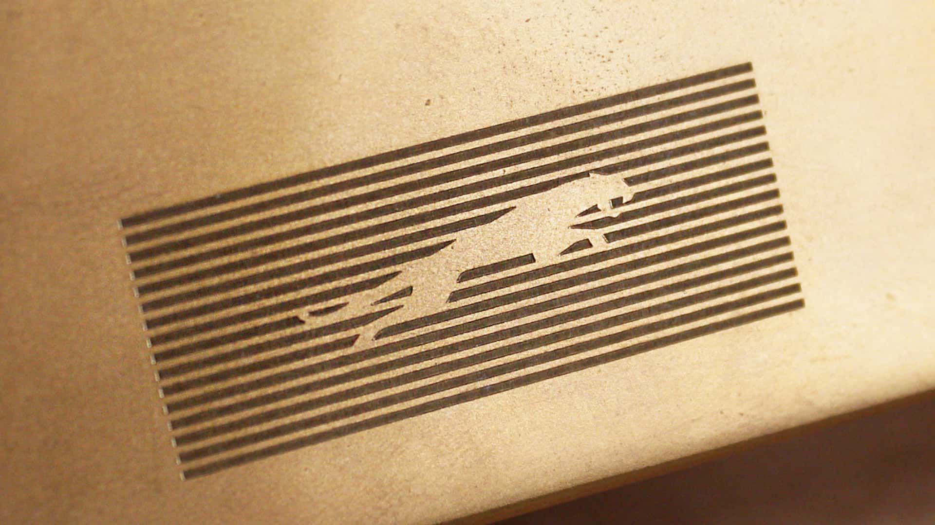
J a G U a r is just their new typeface (I think that’s the name?); and apparently/allegedly is to make the pronunciation closer to UK English, rather than American.
Either way, though - it’s still…
/j
…pReTtY fArKiN’ sToOoPiD.
I would have guessed that was a Puma logo.
Slazenger
You’re making that up.
typeface (I think that’s the name?);
Logotype.
You spell stoopid with three O"s. Maybe your the stoopid,
Yeah that’s pretty dummb
JaGUar

I would have failed every design class I took in college if I submitted that. Why such wide kerning? Why lower case but upper G? Why so round? Why so completely unreadable at a distance because of micro serifs? There isn’t one good design element in this.
It doesn’t say “car” at all either; no elegance or prestige. The old logo was sexy. New one looks like a logo for bottled water or something.
Edit: it’s like going from James Bond to Austin Powers.
Austin Powers has style. Crazy 60s style but style.
Ya, I wanted to use a bland spy but there aren’t any-- I was going to use the Spy vs Spy guys because they are the most generic-looking, but ultimately I kept Powers because while he is stylish and fun, he is also really immature and the logo looks immature to me.
I think they want people to focus on the “agua” and the j and r are just little accents on it like its word art rather than a logo. Like, I literally picture the marketing weirdos at the meeting going off like this.
The “a” is the worst part for me. You can’t see those little stubbs at a distance. So it reads JoGuor at a distance. They didn’t just fail to create a good logo, they failed to preserve the name. One bit of advice I always give is “imagine this logo on the back of a golf card or a Pride brochure. If the logo isn’t crisp and readable in black and white in a 1/2 inch square then it sucks.” This design fails that test. Not just because of the messed up “a” but the wide spacing makes those unreadable "a"s even smaller than if the letters weren’t so widely spaced.
It’s not joguor?
It might just be depending on how far away you are
Wow, they really took their logo from sexy, fast and expensive looking, to looking like an over priced soft drink?
That’s impressive, haha.
It looks like an off brand sportswear shirt you’d find on an African market.
That looks like marketing, let their six-year-old design the logo. Half the letters or lowercase and half are uppercase.
They went from luxury car company to mediocre smartphone brand
They probably paid 10 million for that and a 12 year old could have made it.
GUys I’m from
20402035, here’s Microsoft’s logo
MS corporate comms army did a sik job getting across those inscrutable monolith vibes, I bet when it launched they all clapped (even though clapping is in performance reviews)
BONUS: heres Amazon, Faceberg and Nvideo too (yay diversity)
spoiler


We’ve gone full circle again

I fucking hate this minimalist design trend more than it is probably reasonable to hate an aesthetic. It’s got the personality of unfinished drywall.
Honestly I think unfinished drywall has more personality. It’s utilitarian and rough around the edges, without the shiny surface veneer.
That new Jaguar logo is like somebody took a beautiful old house full of exposed brick and wood work and put a coating of white paint over everything.
It should be those puprple and yellows of Corporate Memphis
The younger generation barely reads let alone reads cursive. This is next generation marketing you aren’t the audience I imagine.
Even if that’s what’s going on (or at least that assumption on the part of the design team is what’s going on), this is shit. You know what requires even less reading than script OR basic print? THE FUCKING PICTURE OF THE FUCKING JUNGLE CAT.
That’s what it is, isn’t it. Retirement in their design department, new hires and this is a Millenial message marketing to Gen Zers (and Alphas too, automotive preference starts early)
